Real-Time Pipeline Health Monitoring
Client: A global digital menu-board manufacturer Stack: AWS (CloudWatch, Kinesis Firehose, S3, Lambda, SNS), Snowflake, Snowpipe, dbt, Keboola, Luzmo, Terraform
The problem
The client runs an ETL pipeline that ingests, transforms, and stores 471GB of IoT telemetry data every day. When that pipeline failed, no one knew until someone noticed the tables weren’t updating. Engineers would then dig back through CloudWatch logs, Step Functions history, and S3 timestamps by hand to reconstruct what had happened and when.
For a pipeline of that size, after-the-fact log forensics is the wrong way to find out something broke. There was no live view of pipeline health and no automated warning when data stopped flowing.
What I built
A health-monitoring layer that sits on top of the existing ETL pipeline and reports, continuously, whether it is alive and how resources are being used. Pipeline failures that previously surfaced only when someone noticed stale data now trigger automated alerts, and a live dashboard shows pipeline health at a glance.
I designed and built the monitoring layer end to end: metric capture, ingestion into Snowflake, the transformation model, the alerting, and the dashboard. The underlying ETL pipeline it watches predates this work; this is the observability layer built on top of it.
How it works
CloudWatch metrics → Metric Stream → Kinesis Firehose → S3 → Snowpipe → Snowflake (raw) → dbt (orchestrated by Keboola) → Snowflake (modelled) → Luzmo dashboardCloudWatch metrics from the pipeline's Step Functions, Lambda, and EMR Serverless components are tapped in real time by a Metric Stream, buffered by Kinesis Firehose (60-second windows, GZIP-compressed to cut file size roughly tenfold), and landed in S3. An S3 event triggers Snowpipe to auto-ingest into Snowflake — no polling, no scheduled loads. A dbt model transforms the raw JSON into a queryable metrics table, aggregating each metric into 60-second windows and extracting per-function and per-state-machine dimensions so a failure can be traced to the exact component that caused it.
A few decisions worth calling out:
Scheduled to the pipeline's rhythm. The dbt transformation runs in Keboola, which reads the model code from version control and runs it on a timer tuned to the periods when the main pipeline is active and its health matters most. Monitoring effort is concentrated where it has the most value rather than running flat out around the clock.
Deliberate isolation. Monitoring data uses a separate S3 prefix and separate dbt models, so the observability layer cannot interfere with the pipeline it is watching.
Lightweight by design. The monitoring layer carries only metric metadata — a tiny fraction of the 471GB/day the pipeline itself moves — so it adds negligible storage and compute overhead to the client's infrastructure. A 30-day retention policy on the metrics tables keeps that footprint from growing over time.
Infrastructure as code. The entire layer — Firehose, Metric Stream, IAM, Lambda, SNS, alarms — is defined in Terraform and version-controlled, so it can be reviewed, reproduced, and redeployed deliberately.
The dashboard
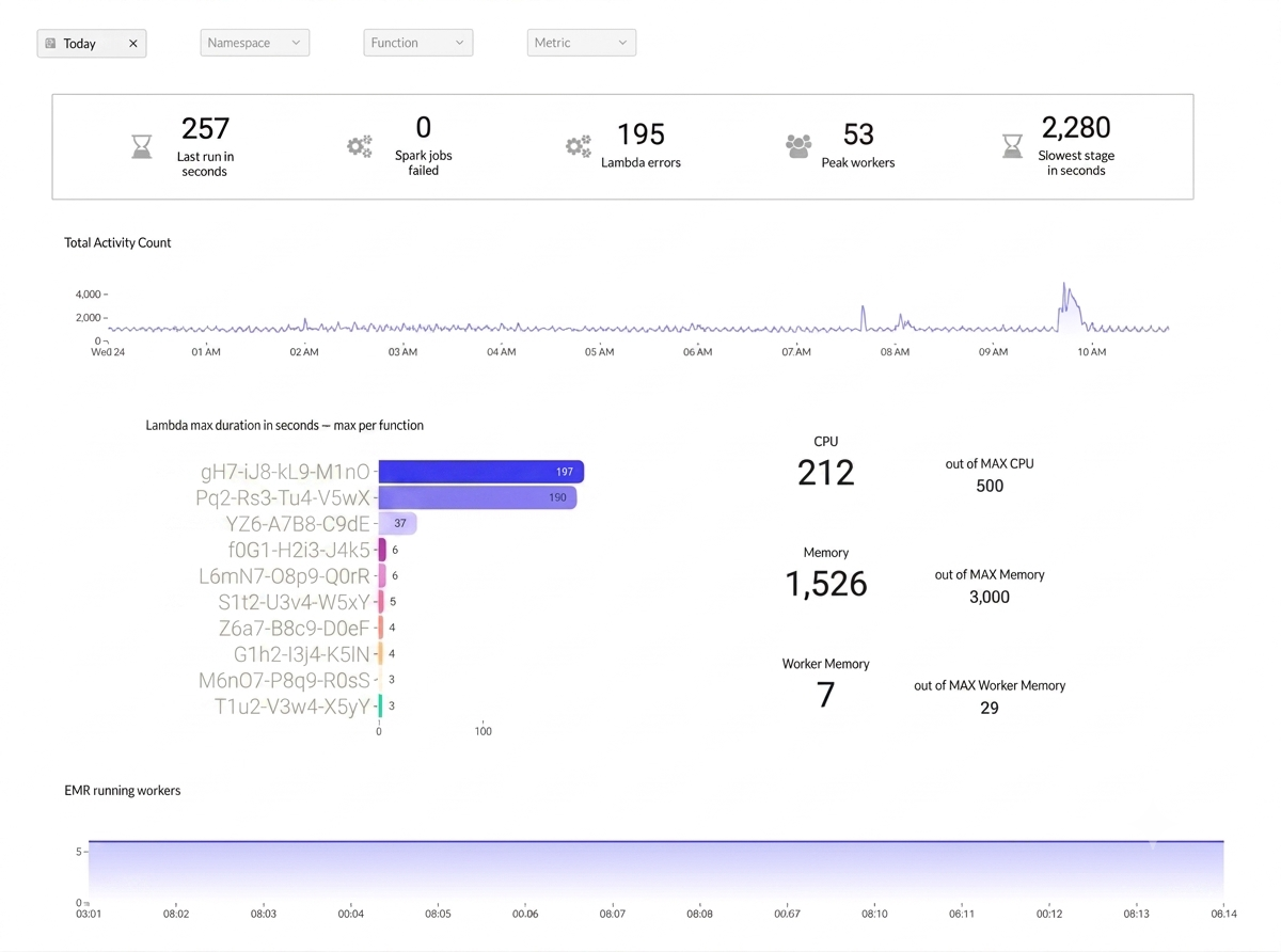
The Luzmo dashboard turns the metrics into a health view a stakeholder can read in seconds. At the top, five KPIs answer the immediate questions: how long the last run took, whether any Spark jobs failed, how many Lambda errors fired, peak concurrent EMR workers, and the slowest stage. Below that, an activity heartbeat shows pipeline volume over the day (the daily run shows up as a clear spike), a per-function bar chart ranks the slowest Lambda executions, and EMR CPU, memory, and worker utilization are each shown against their ceilings so resource starvation is visible before it becomes a failure. Global filters on namespace, function, and metric let an engineer slice straight to the relevant component during an incident.
The dashboard can also raise its own alerts off chart thresholds, so engineers are notified even when no one is watching it.
Alerting, and its honest boundary
There are two independent alert paths. At the infrastructure level, a CloudWatch alarm fires after two hours if data stops flowing into storage. At the dashboard level, Luzmo charts can raise alerts off threshold breaches set in individual charts. Having two independent paths means a single point of failure does not take the alerting down with it.
The current alerting catches infrastructure failure, the case where metrics stop arriving. It does not yet catch data staleness, where metrics keep arriving but are late or wrong. The transformation model already carries a load timestamp specifically so that check can be added as the next layer. Naming that boundary is deliberate: the system is honest about what it does and does not guarantee.
Next steps
The dashboard currently reads from a single Snowflake table. The next iteration adds purpose-built tables; for example, one surfacing only the latest status per pipeline component — so each dashboard element queries cleaner, more targeted data instead of deriving everything from one general table. Further refinements will follow from user feedback, tuning which metrics are shown and how, once the team has worked with it in practice.
Result
A pipeline moving 471GB a day is no longer monitored by whoever happens to notice the dashboard looks old. Failures surface automatically through two independent alert paths, and pipeline health — run times, failures, errors, resource pressure — is visible on a live dashboard built for the engineers who operate it.