IoT Health Monitoring Dashboard for Device Uptime & Maintenance
Client: Small-scale manufacturer of digital screen devices
Tools Used: Google BigQuery, SQL, Power BI
Type: End-to-end data pipeline and dashboard build
Status: Phase 1 completed — first version delivered for stakeholder feedback
Background
The client operates six digital screens installed across two locations. These devices send IoT health data every 5 minutes, capturing metrics like battery levels, CPU and screen temperature, RAM usage, connectivity, and content playback status. Despite this high-frequency data, the client has no clear visibility into the health of their devices. They often find out about problems only when customers report that a screen is not functioning.
✅ Task Definition
Build a full-stack data solution that allows:
Management to monitor the overall health and uptime of the device fleet across locations.
Maintenance to identify individual device issues in real-time, spot recurring problems, and transition from reactive to proactive maintenance.
The solution must:
Ingest and transform raw IoT logs.
Detect incidents (e.g., overheating, low battery, offline, or not playing content).
Track uptime and severity scores.
Visualize key metrics through actionable dashboards.
🔍 Summary - Insights & Next Steps
This project demonstrates how structured cloud analytics and clear dashboards can turn raw IoT data into actionable insight. By designing a scalable data model in BigQuery and building interactive dashboards in Power BI, I enabled the client to monitor device uptime, detect root-cause issues, and support both management and maintenance with tailored views. The first version already highlights key failure patterns — such as overheating or low battery — laying the foundation for proactive maintenance.
Next, I will present this phase-1 pipeline to the client to validate whether it answers their key business questions, learn what they like or dislike, and identify any new questions that arise. Real insight often begins when users see their data — and this first iteration opens the door to a more focused and collaborative development process. Future steps include refining incident logic, modifying risk scoring becoming more predictive, and automating alerts to move from reactive fixes to preventative action.
Quick overview of the dashboards created as phase 1 deliverable to continue discussion with client.
Approach & Strategy
This project was treated as the first iteration in a long-term data improvement initiative. The idea was to build a working pipeline quickly, start answering key business questions, and open a feedback loop with stakeholders to improve the model iteratively.
Steps Taken:
Data Ingestion & Storage: IoT logs were loaded into Google BigQuery as a partitioned fact table, ensuring scalability.
Transformations: SQL was used to:
Normalize and enrich the logs with status flags and severity scores.
Detect and merge incident windows using time-aware logic (e.g., gaps ≤ 10 min).
Aggregate daily metrics like uptime % and device health scores.
Data Modeling: Dimensional model created with fact table and supporting dimension tables (devices, dates, locations, incidents).
Visualization: Power BI dashboards built for two personas:
Management View: Location-level health, fleet overview, uptime trends.
Maintenance View: Critical device list, incident types, screen status timeline.
Validation: DAX metrics were tested against SQL outputs for consistency; filters and drilldowns verified.
🧠 Why This Matters
To the end customer, the screen either works — or it doesn’t. But for the manufacturer, early signs like high temperature, low battery, or lack of playback provide critical warning signs. This project is about:
Bringing visibility into the invisible.
Saving time and money through proactive issue detection.
Building a scalable foundation for predictive alerting and automation.
🔁 Next Steps
Refine incident detection logic further.
Improve severity scoring (rebranded as “Health Score” for better communication).
Introduce automatic alerts via Power BI
Engage with maintenance and management to prioritize key views and metrics.
Begin building predictive models once enough history is gathered.
🔍 Python Data Exploration
To understand the behavior of each screen device and assess data quality, I began with Python-based exploratory analysis using Pandas, Matplotlib, and Seaborn.
📉 Data Frequency & Gaps
Each device is expected to report every 5 minutes. But this isn’t always the case:
Row counts vary significantly across devices.
Gaps >15 minutes reveal irregular logging and potential connectivity or battery issues.
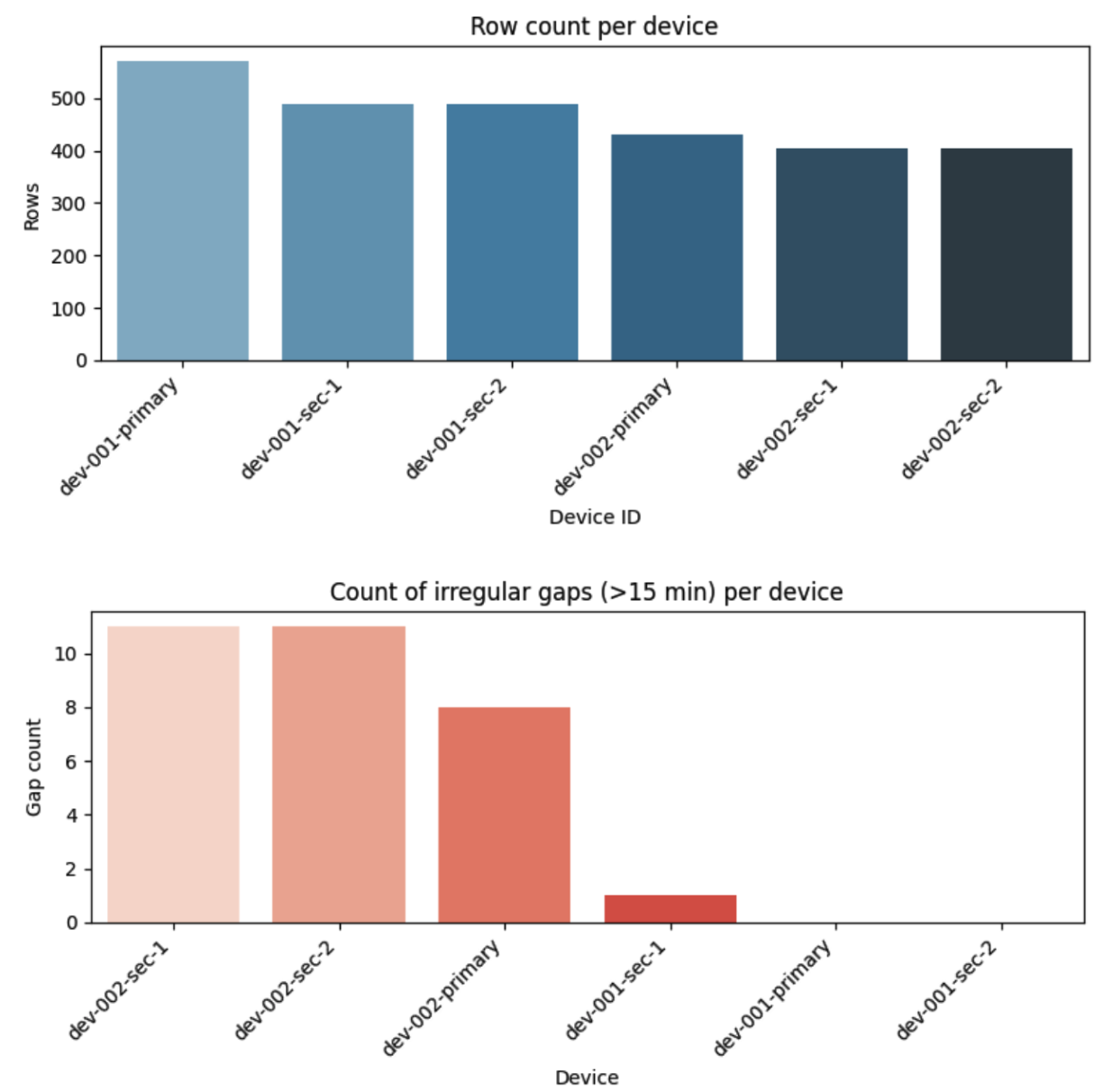
These irregularities directly affect how we define downtime and merge incident periods later in the pipeline.
📈 Device Behavior Over Time
Visualizing time-series trends for key attributes like RAM usage and CPU temperature showed clear behavioral differences between devices:
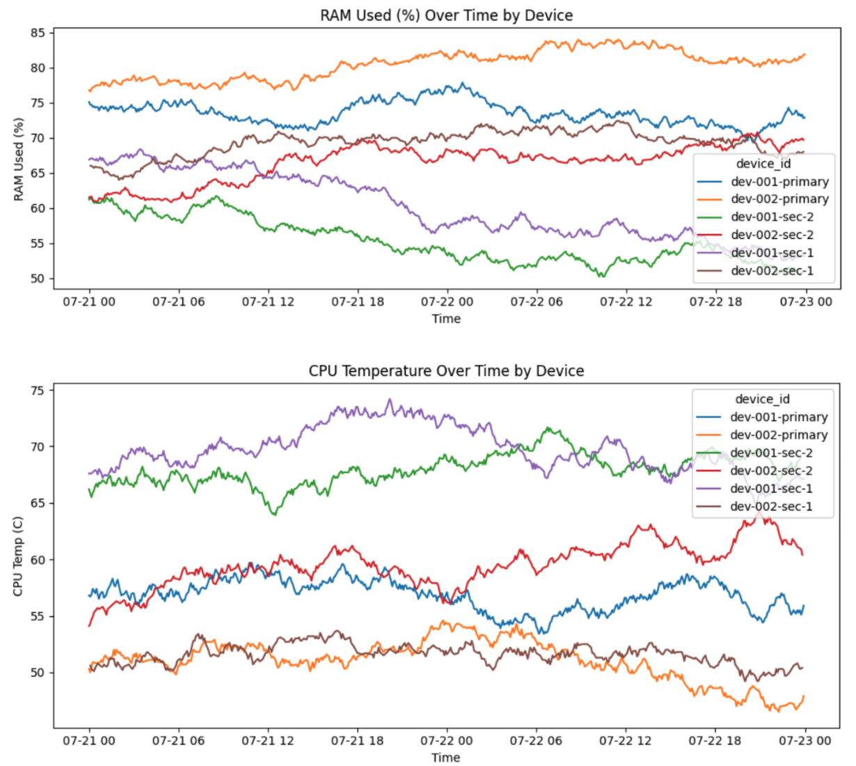
This suggests that applying a single, fixed threshold across all devices may lead to inaccurate incident detection. A more robust approach could be to:
Learn normal operating ranges per device
Flag deviations from individual baselines as potential anomalies
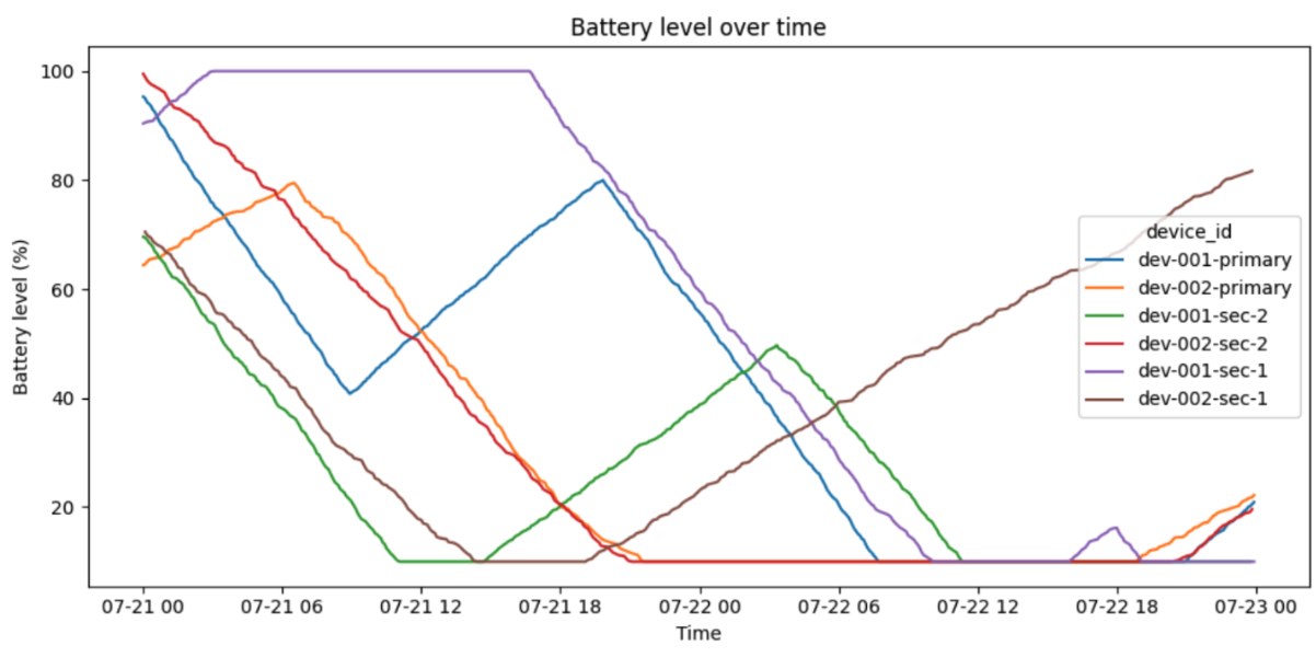
🔋 Battery Level as Early Indicator
Battery level emerged as a highly valuable and interpretable metric:
When below 20% and not charging, the device is at risk of shutting down
Over time, battery depletion patterns could signal battery health decline.
In future iterations, I could build a “time to battery death” prediction using discharge rates.
📺 Screen Content Status = Ground Truth
The most critical signal for client experience is whether the screen is actually showing content.
This binary status (content_playing = TRUE/FALSE) was visualized using a red/green timeline — a clear, visual cue of when devices are doing their job vs. when they’re failing.
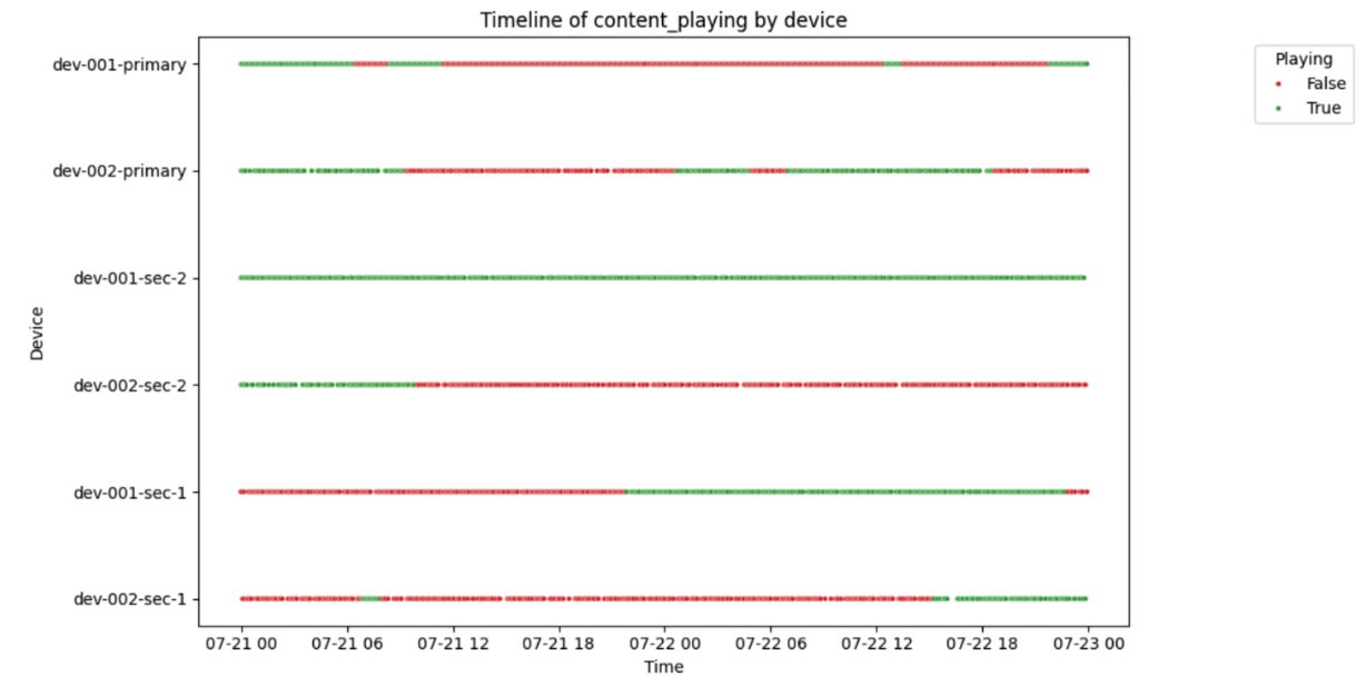
This signal became my primary proxy for uptime during this first iteration of the pipeline.
🧠 Learnings & Next Steps
So far, this was light-touch exploration to:
Understand device behavior patterns
Spot quality issues in the data
Identify reliable early signals of failure
In future iterations, I plan to:
Use correlation & regression tests to uncover predictive patterns
Tune thresholds per device
Explore multi-metric incident scoring
Enable smarter alerting based on combined risk signals
Environment
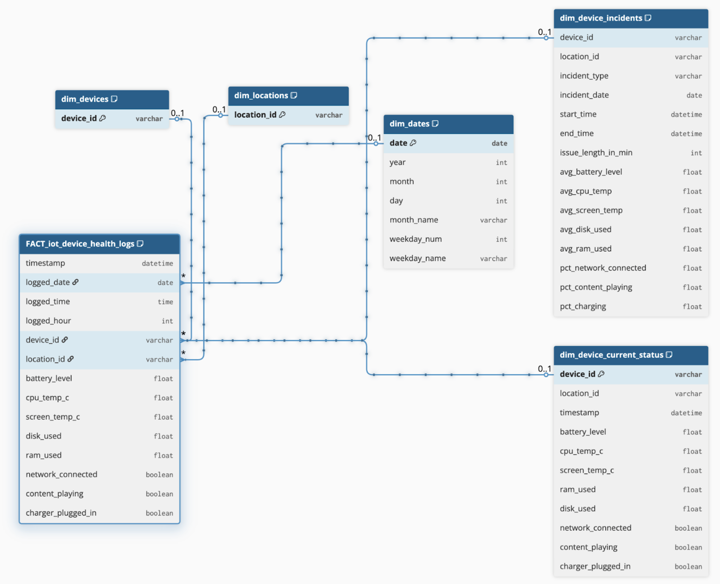
🧠 BigQuery Environment & Data Modeling
I uploaded the raw IoT log data to Google BigQuery, ensuring automatic schema detection correctly handled the field types (e.g., timestamp, BOOLEAN, FLOAT64, etc.).
From there, I built a set of structured, query-ready tables to support both analysis and dashboarding. These are outlined in detail in the Data Model Documentation, which includes table definitions, SQL logic, and foreign key relationships.
📎 The full data model document is available behind this link 👉 DATA MODEL DOCUMENTATION
🗃️ Core Tables
Key components of the BigQuery environment include:
✅ FACT_iot_device_health_logs
(Fact Table)
Granular base table, partitioned by date
Contains all raw IoT readings: battery level, CPU temp, RAM, network status, etc.
Serves as the foundation for most metrics
✅ dim_device_incidents
Contains one row per incident period
Incidents are merged by logic to handle gaps/missing logs
Includes both incident type and average attributes during the period (e.g., avg battery, RAM)
Enables clean incident reporting and root-cause analysis
✅ dim_device_current_status
A view of the latest record per device
Powers dashboard elements for current fleet health
Used by both management and maintenance personas
✅ dim_devices, dim_locations, dim_dates
Standard dimension tables for consistent filtering and slicers in Power BI
🧱 A visual schema of this model is included below.
☁️ Cloud-Based Processing
This structure keeps heavy transformation logic in BigQuery, which:
Ensures scalability as data volume grows
Reduces load on Power BI refreshes
Keeps logic centralized and transparent
📝 Summary
BigQuery serves as the central data warehouse in this project — hosting clean, structured, and optimized tables. This allows Power BI to focus on visualization and interaction, while all complex calculations (e.g., incident logic, uptime%, severity scoring) are handled in SQL.
✅ This separation of concerns results in a fast, scalable, and maintainable solution — ready to grow with future needs.
Power BI Dashboards
After preparing the data in BigQuery, I connected Power BI directly to the dataset using the native BigQuery connector. This allowed me to pull only curated tables and views, keeping the model clean and fast to refresh.
📈 Persona-Based Dashboards
Two dashboard pages were designed, each addressing the goals of a specific stakeholder group:
👨💼 Management Dashboard
Focus:
Uptime by location
Severity score per device
Current health overview
Location-level summaries
Visuals:
KPI cards - Latest device statuses based on content showing or not
Count of incidents per location/device
Location/Device Health Index (aggregated metric based on devices status to determine a health score)
Uptime % per device on selected day
🧑🔧 Maintenance Dashboard
Focus:
List of device’s recorded issues
Trends per device
Daily downtime per device
Heatmaps of issues per day/hour
Visuals:
Table with conditional formatting (color-coded by severity)
Drill-through to single-device timelines
Tooltip-enabled visuals showing incident context
Filters for location, device, issue type, and time
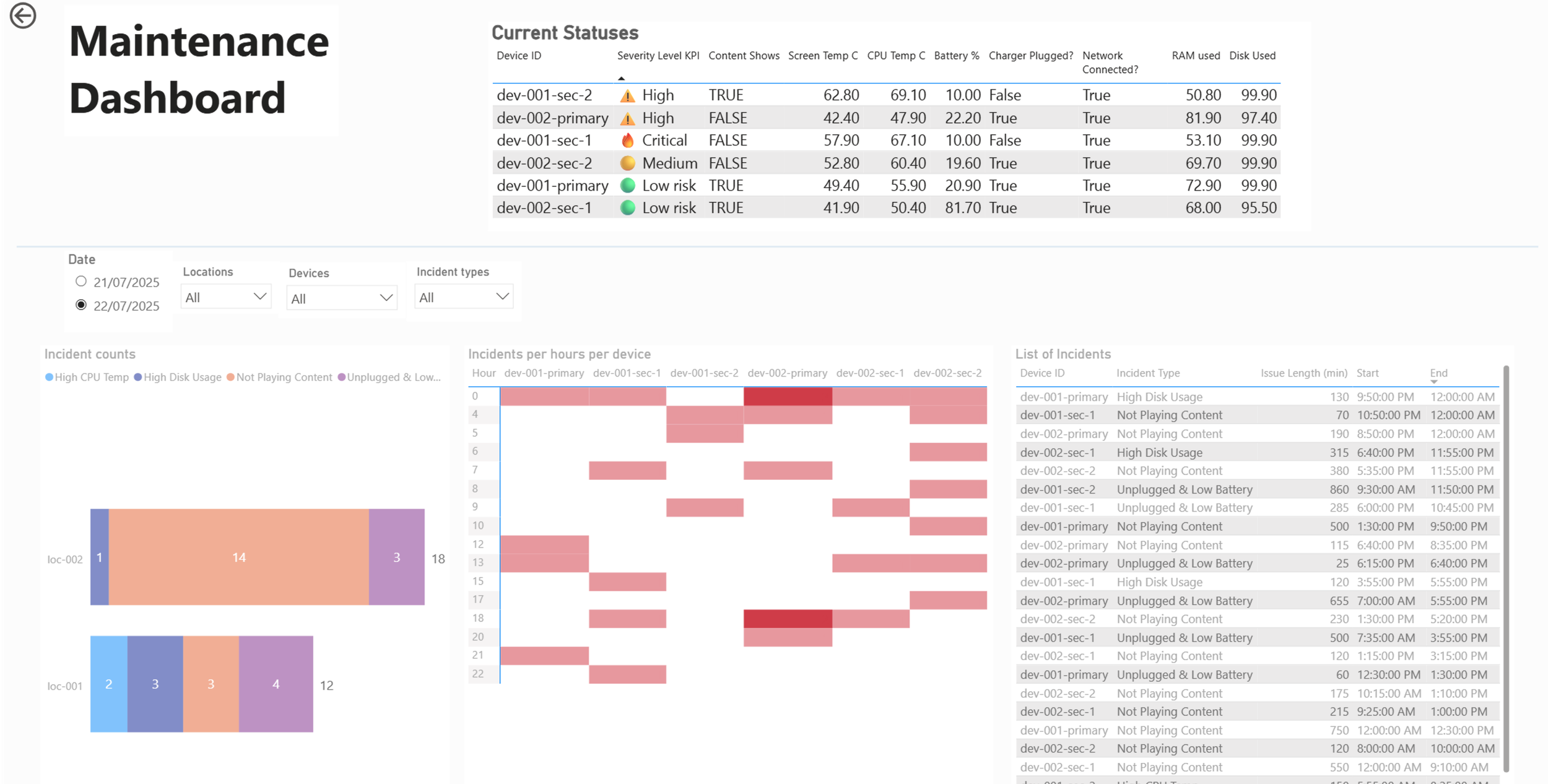
🧠 Interactivity & UX Features
Slicers for location, device, date, incident type
Can be added based on clients needs: Bookmarks and tooltips to provide extra context
Severity Score logic surfaced through conditional formatting
DAX measures built for:
Uptime vs downtime
Severity categories
Daily/Hourly averages
Alert thresholds
🔁 Refresh Strategy
While real-time data was not implemented in this phase, scheduled refreshes can be configured in BigQuery and Power BI Service to auto-update reports. A future step could include data alerts or near-real-time visual refreshes using streaming datasets.