Task
In this sample project to demonstrate end-to-end Power BI methodology from data cleaning and modelling through to insight delivery. This fictional client was facing a period of uncertainty and needed a sharper view of their markets. Profitability had become harder to maintain, and leadership wanted clear evidence on where to focus action in order to turn performance around.
Insights
The dashboard quickly surfaced two major findings:
Performance shifted sharply after February — while February was strong, both March and April saw a steep downturn.
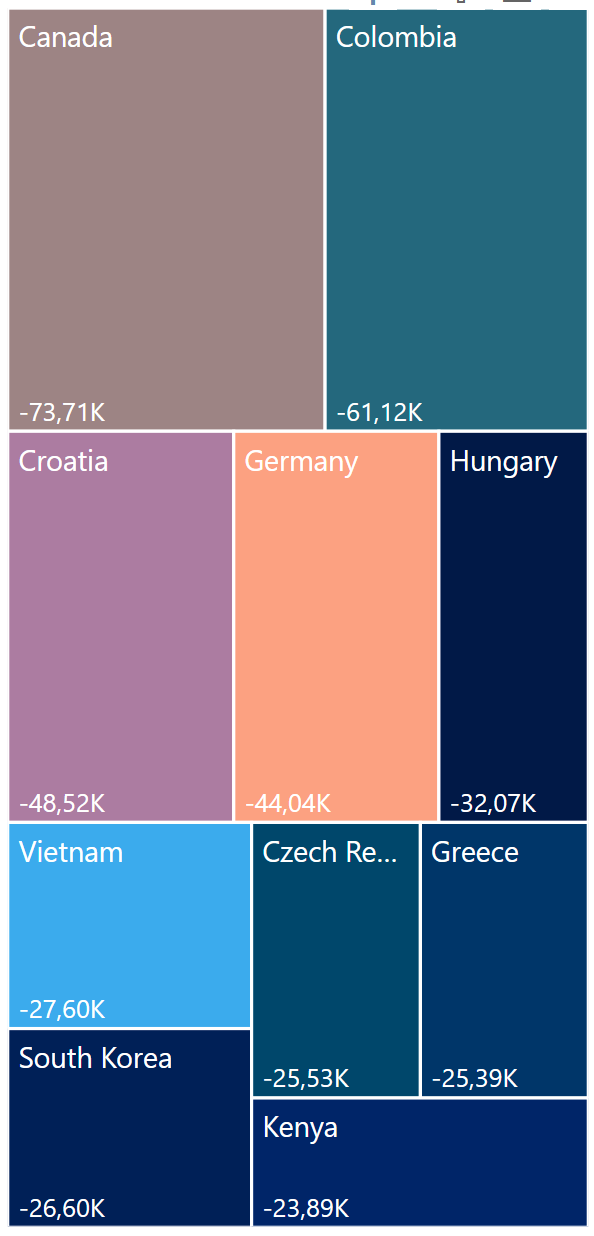
Canada emerged as the largest losing market in 2024, with the decline driven by three specific products.
Conclusion & Impact
The dashboard gave the client a clear, data-driven view of their markets at a time when profitability was under pressure. By spotlighting the bottom-performing countries and enabling drill-down into product and client details, it provided the ability to pinpoint the true drivers of decline.
Key insights—such as the downturn in Canada driven by three products, and the identification of clients with high profit margins but low sales volume—equipped leadership with concrete options for action. With its intuitive design, dynamic filters, and clear visuals, the dashboard now serves as a practical decision-making tool that helps the company focus resources where they will have the greatest impact on profitability.
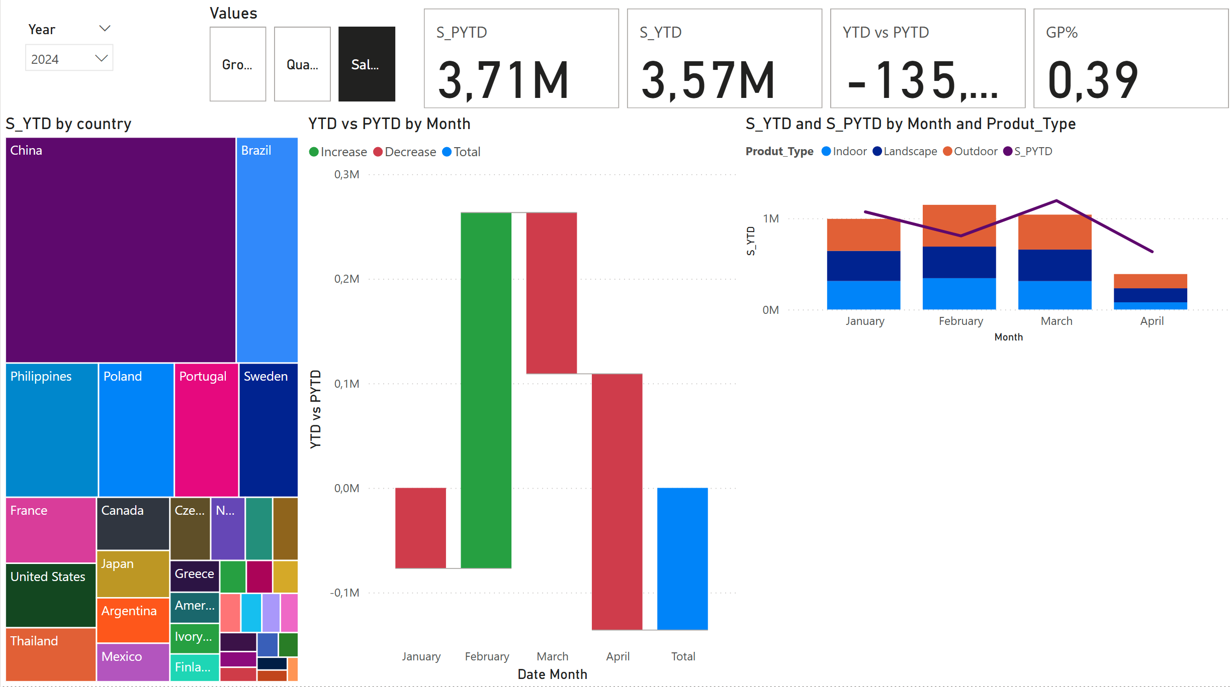
Final Dashboard
To address this, I built a dashboard that puts the spotlight on the bottom 10 countries, making underperformance impossible to overlook. A waterfall chart illustrates how each market contributes to the overall result, while a scatterplot allows users to drill deeper into patterns and outliers. At the top, key indicators show Year-to-Date (YTD) versus Prior Year-to-Date (PYTD), with intuitive blue/red color coding to instantly signal positive or negative performance.
These insights point the user directly to where further investigation is needed. In the next section, I take a closer look at Canada and outline potential follow-up actions. More broadly, the dashboard enables users to explore country and product-level data to uncover additional patterns and understand the overall situation in depth.

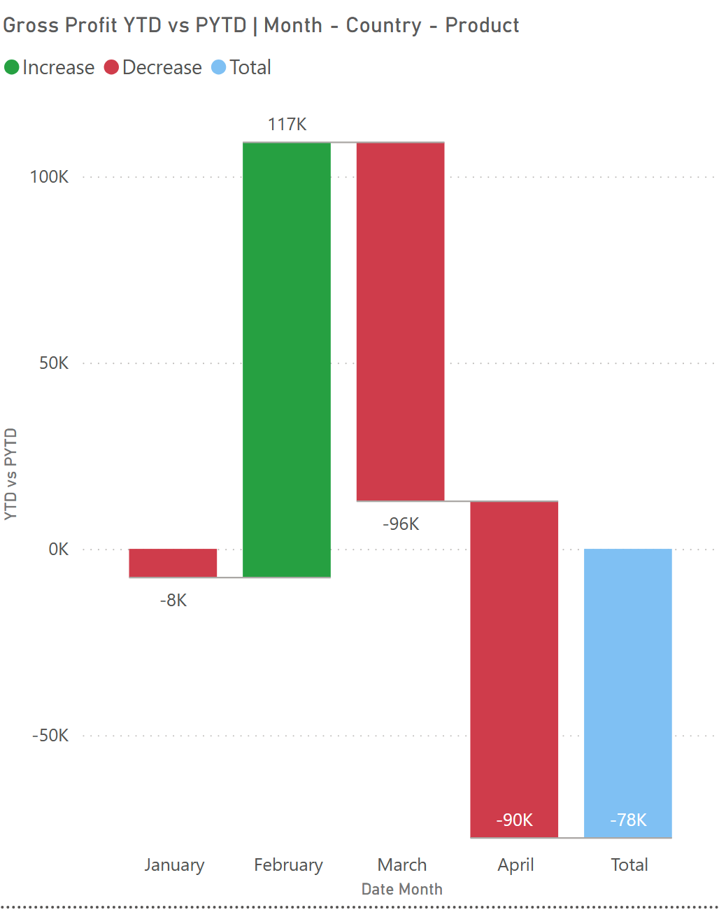
In February Gross Profit was larger than previous year, but then 2024 numbers took a dive.
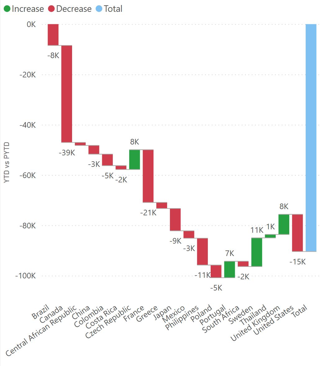
Canada is biggest individual losing market as shown in waterfall and treemap with -39k USD
Deep Dive: Canada
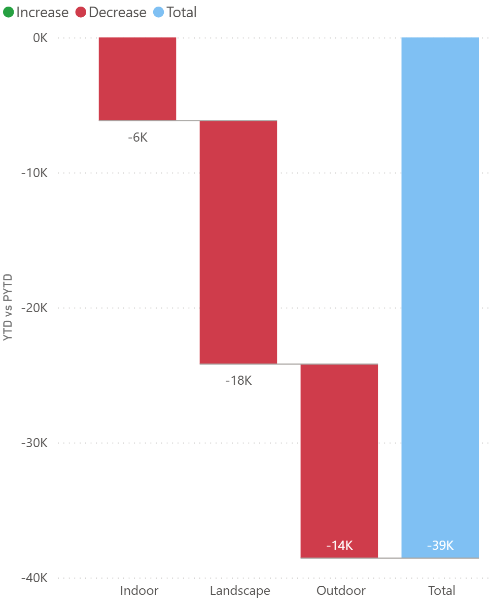
Looking closer at Canada in March in below left side image reveals that all segments turned negative, with the landscaping category leading the decline. A deeper breakdown of landscaping highlights three products as the main drivers behind this downturn in right side image.
As a next step, these products could be compared across countries to answer key questions:
Are these products simply losing favor with Canadian consumers?
Or are the same products driving negative trends in other markets as well?
This approach helps separate local market issues from global product challenges, guiding the client toward more targeted actions.
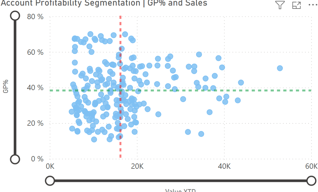
Client Profitability View
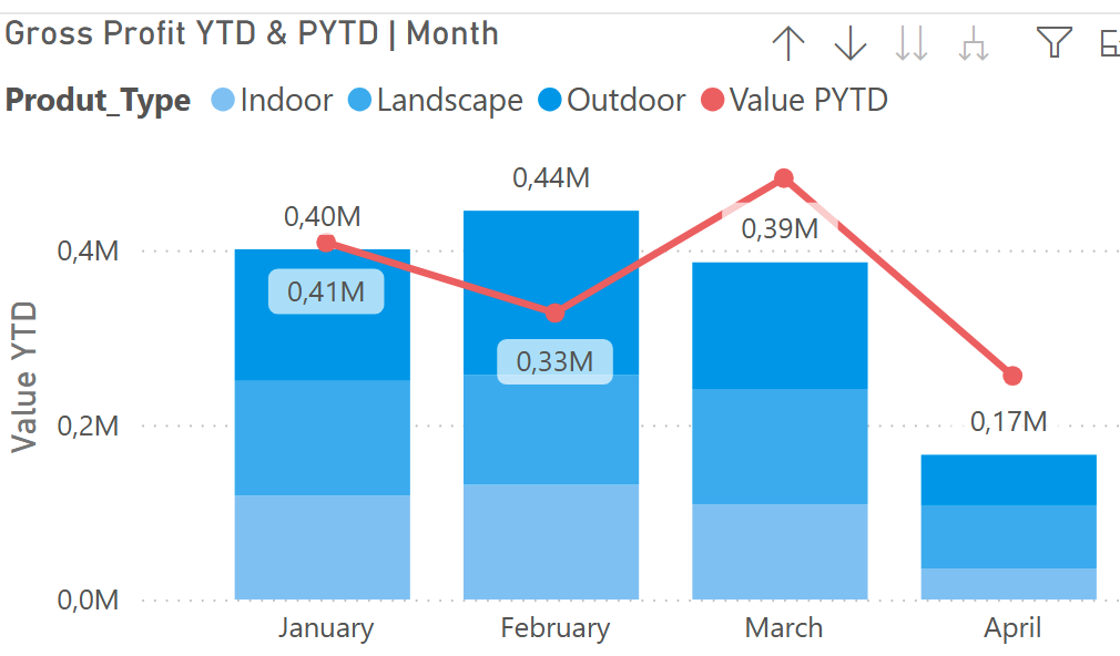
Using the zoom slider, users can quickly identify which clients contribute the most to overall profit. For instance, some clients show a high Gross Profit % but low absolute sales value (as illustrated in the example below).
These findings highlight an opportunity: by increasing sales efforts and strengthening relationships with such clients, the company can better serve its most profitable customers and capture additional growth.
Treemap Analysis
Building on the insights from the waterfall chart (which shows how each market contributes to overall results) and the scatterplot (which allows deeper pattern analysis), the treemap adds another perspective by highlighting the bottom 10 countries by gross profit compared to last year.
This view makes it easy to spot where performance has slipped the most. From here, users can drill further into the data—as demonstrated with Canada—to identify the drivers of underperformance and plan targeted actions to restore profitability.
Work Process
The workflow followed a clear sequence:
Upload the Excel file
Clean and prepare the data
Create new tables and measures
Build visualizations
Finalize and refine the dashboard
Data Cleaning
During the cleaning stage, I ensured that all table names, column names, and data types were consistent and accurate. I also updated and removed duplicates from the unique ID column to secure data integrity before moving on to analysis.
Created date table
Dim_Date =
CALENDAR (
DATE ( 2022, 1, 1 ),
DATE ( 2024, 12, 31 ))
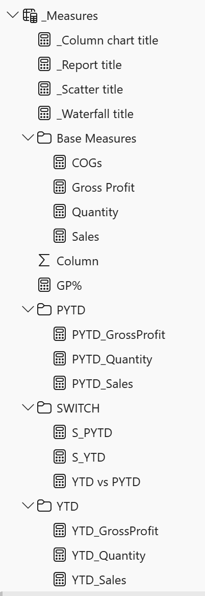
Created multiple measures, a slicer and organized all measures in their own folders.
For example
PYTD_GrossProfit =
CALCULATE (
[Gross Profit],
SAMEPERIODLASTYEAR ( Dim_Date[Date] ),
Dim_Date[InPast] = TRUE)
Created relationships
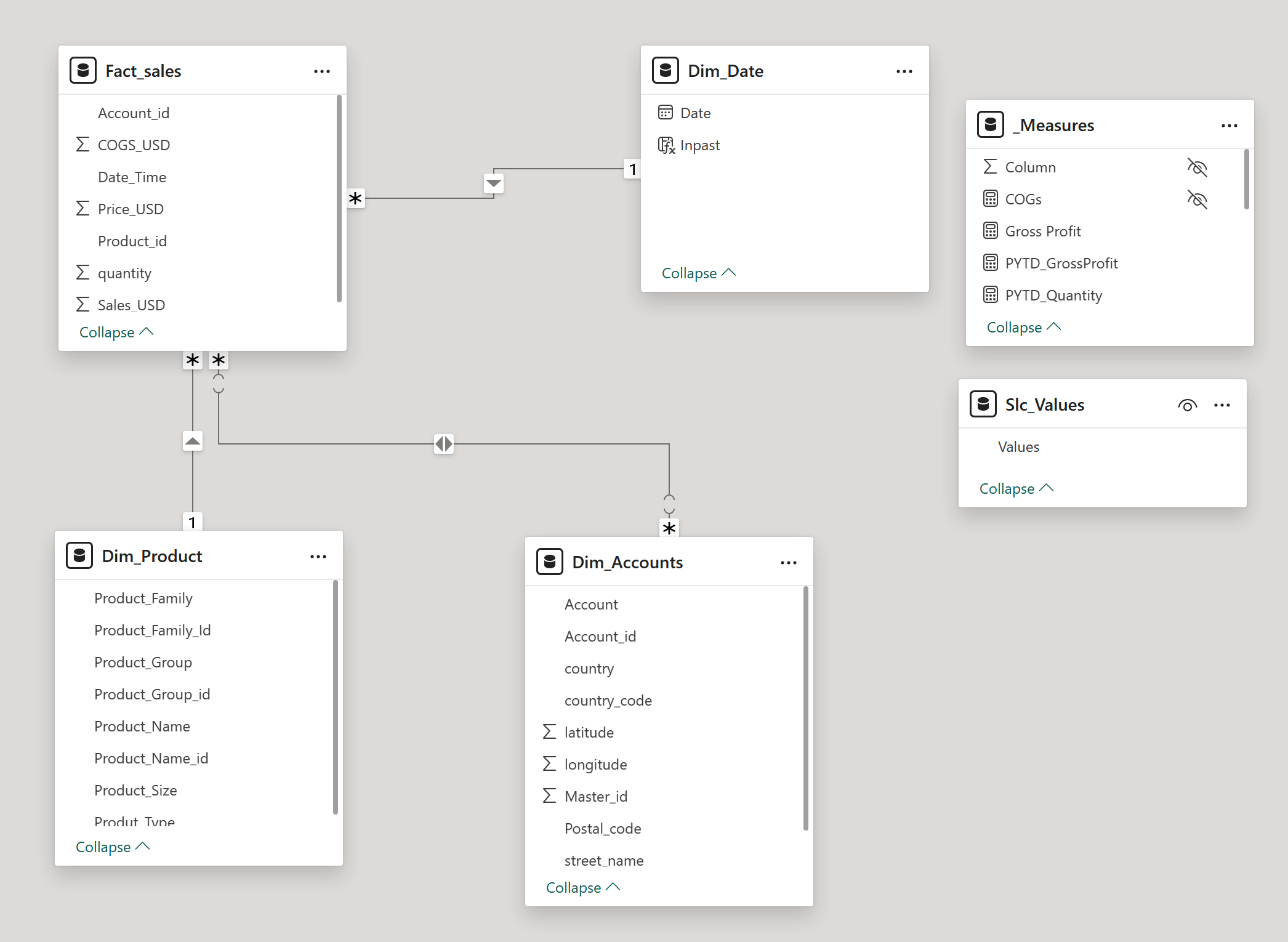
Data Model Note
A many-to-many relationship exists in the model; however, it is not expected to influence results. The Dim_Accounts table is not used in calculations and serves only for data exploration, with no active joins affecting other tables.
First Draft
With all planned measures and updates in place, the first draft of the dashboard was created. This stage began with adding KPIs, slicers, and three initial visualizations to establish the layout and flow of insights.
Design Adjustments
The overall color palette was unified in blue, creating a consistent and professional theme. Filters and titles were refined to keep the focus on the most relevant data—for example, excluding 2022 as it was not needed for analysis. Titles were also set to update automatically based on user selections: when a user clicks Sales, both the data and the title adjust accordingly. This dynamic approach ensures clarity and prevents confusion, avoiding issues such as static screenshots where context can be lost.
Tables and Measures
Final list of Measures, Tables and their content
Final dashboard


The completed dashboard, with its unified color theme, provides users with clear and intuitive options to drill into the data. It directs attention to underperforming countries and their details, helping the company identify problem areas and uncover opportunities to improve profitability.