Task:
The objective was to design two dashboards for managers and executives that provide a clear, quick view of sales performance and customer trends. The dashboards needed to be intuitive, interactive, and efficient—helping stakeholders understand how the business is performing at a glance.
Insights
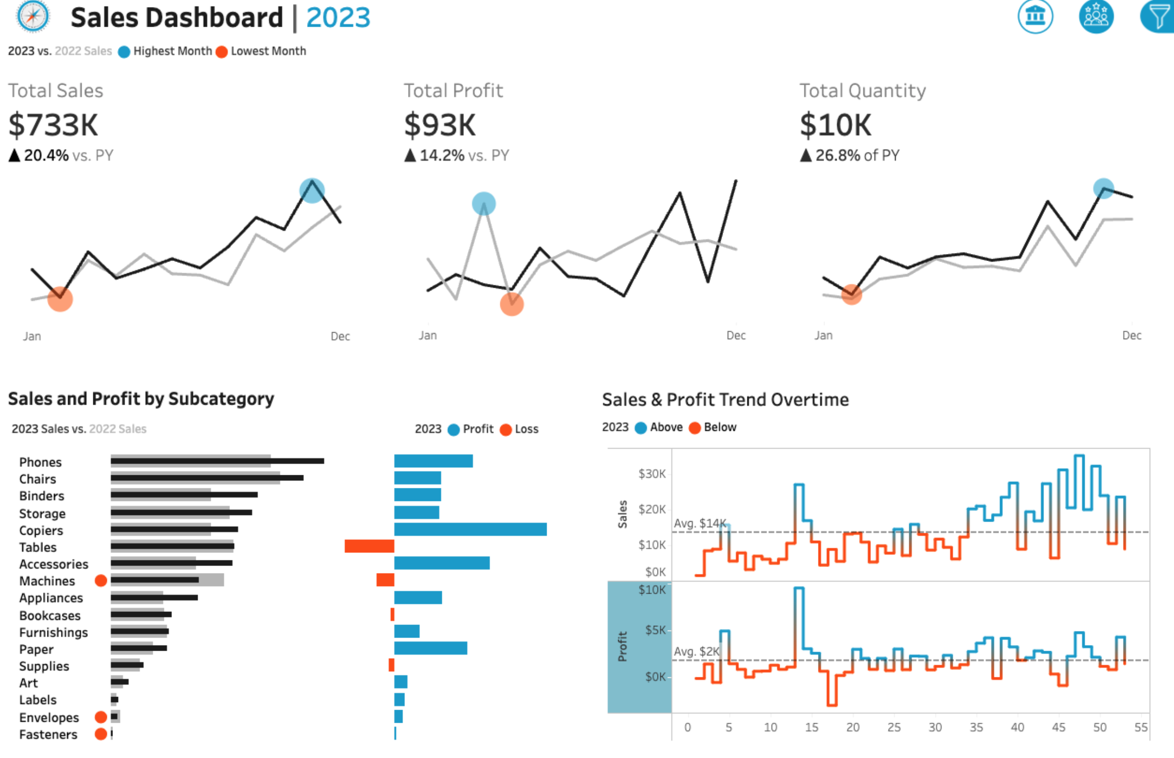
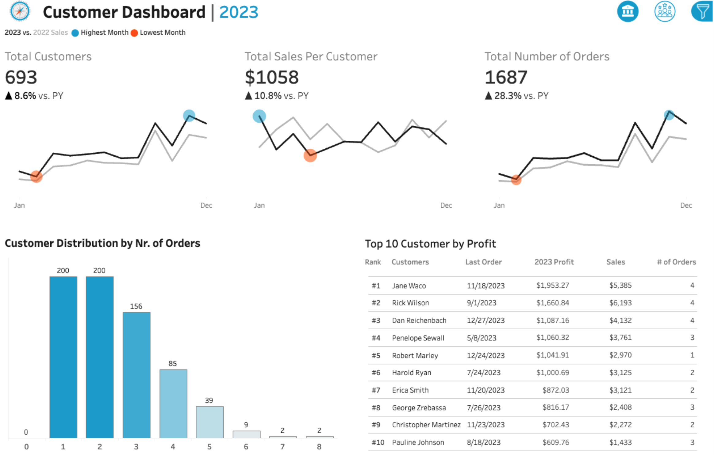
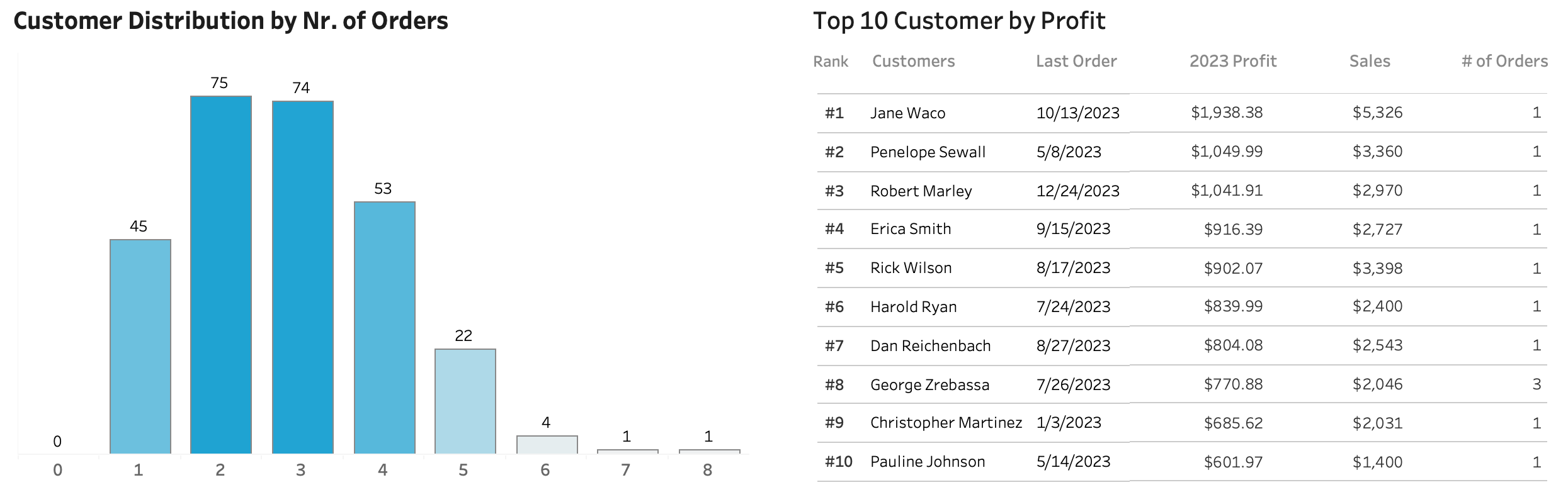
We can now quickly identify most profitable customers on a TOP 10 table, and which subcategories are behind in sales or profits as marked with orange colour. KPIs provide a quick clanse overview of the development.
Conclusion
Client has received a dashboard providing interactive and instant visibility to their sales data and top customers. Helping management to make quick decisions where to focus their attention.
Final Dashboards
Process
I followed a rigorous end-to-end Tableau workflow: capturing user stories, sketching wireframes, building a star-schema data source, creating dynamic calculated fields (e.g., current-year vs. prior-year KPIs, min/max markers), and assembling fully interactive dashboards.
Features included:
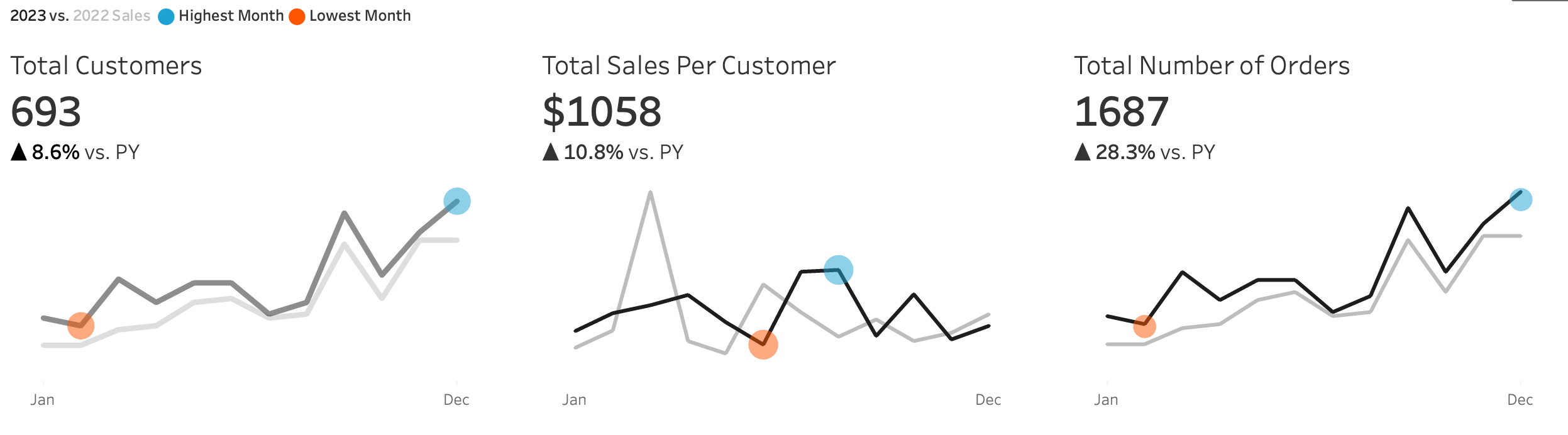
KPI BANs (Sales, Profit, Quantity YTD vs. PYTD)
Sparklines to track performance over time
Bar-in-bar comparisons of subcategories
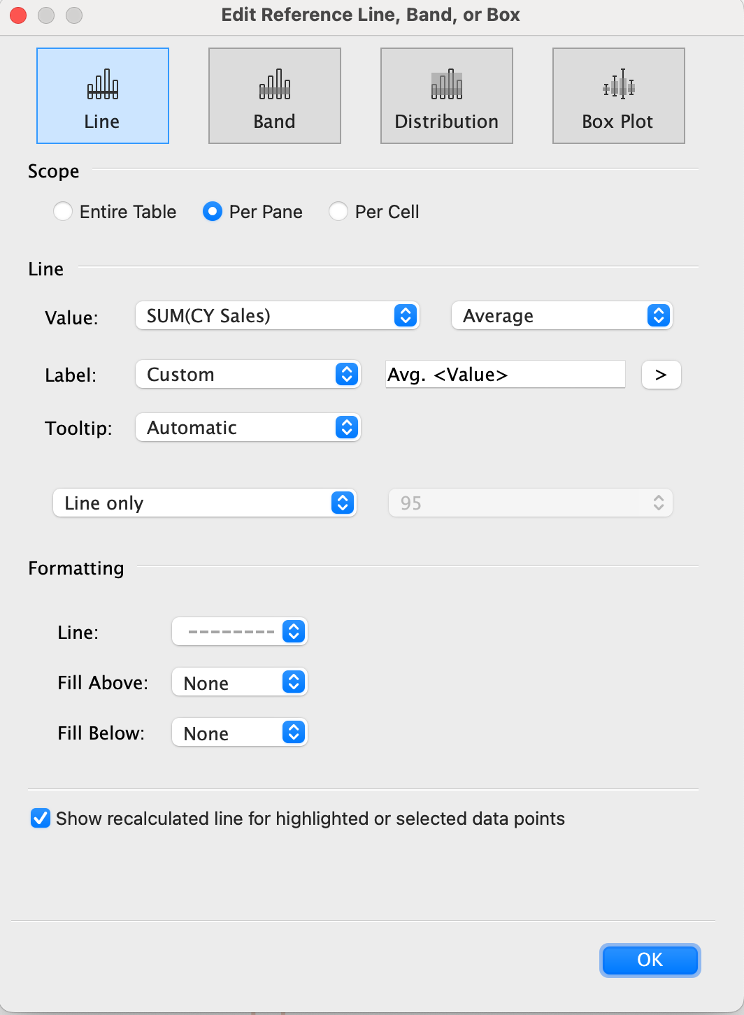
Weekly trend lines for sales and profit with above/below average markers
A year-selector parameter and collapsible filter panel for flexible exploration
Key Requirements
KPI Overview
KPI Overview → Current-year vs. prior-year totals for sales, profit, and quantity
Sales Trends → Monthly performance with highest/lowest months highlighted
Product Subcategory Comparison → Sales and profit comparisons across subcategories
Weekly Trends → Weekly sales/profit vs. averages, with above/below thresholds clearly marked
Design & Interactivity → Dynamic year selection, easy navigation between dashboards, interactive filters by category, subcategory, region, state, and city
Data
The dashboards were built on clean CSV files. I reviewed and adjusted data types where needed, particularly dates, region fields, and numerical columns. Data quality was strong, requiring no corrections beyond ensuring consistency and accuracy for analysis.


Build
Calculations
Need two separate calculations to show current year and previous year numbers. Then separate versions created for each necessary calculation.
For example for Current Year Sales:
IF YEAR([Order Date]) = [Select Year] THEN [Sales]ENDPrevious Year Sales:
IF YEAR([Order Date]) = [Select Year] - 1 THEN [Sales]END
To show the change between current and past year:
(SUM([CY Sales]) - SUM([PY Sales])) / SUM([PY Sales])
To mark max and min points on the line:
IF SUM([CY Sales]) = WINDOW_MAX(SUM([CY Sales]))THEN SUM([CY Sales])ELSEIF SUM([CY Sales]) = WINDOW_MIN(SUM([CY Sales]))THEN SUM([CY Sales])END
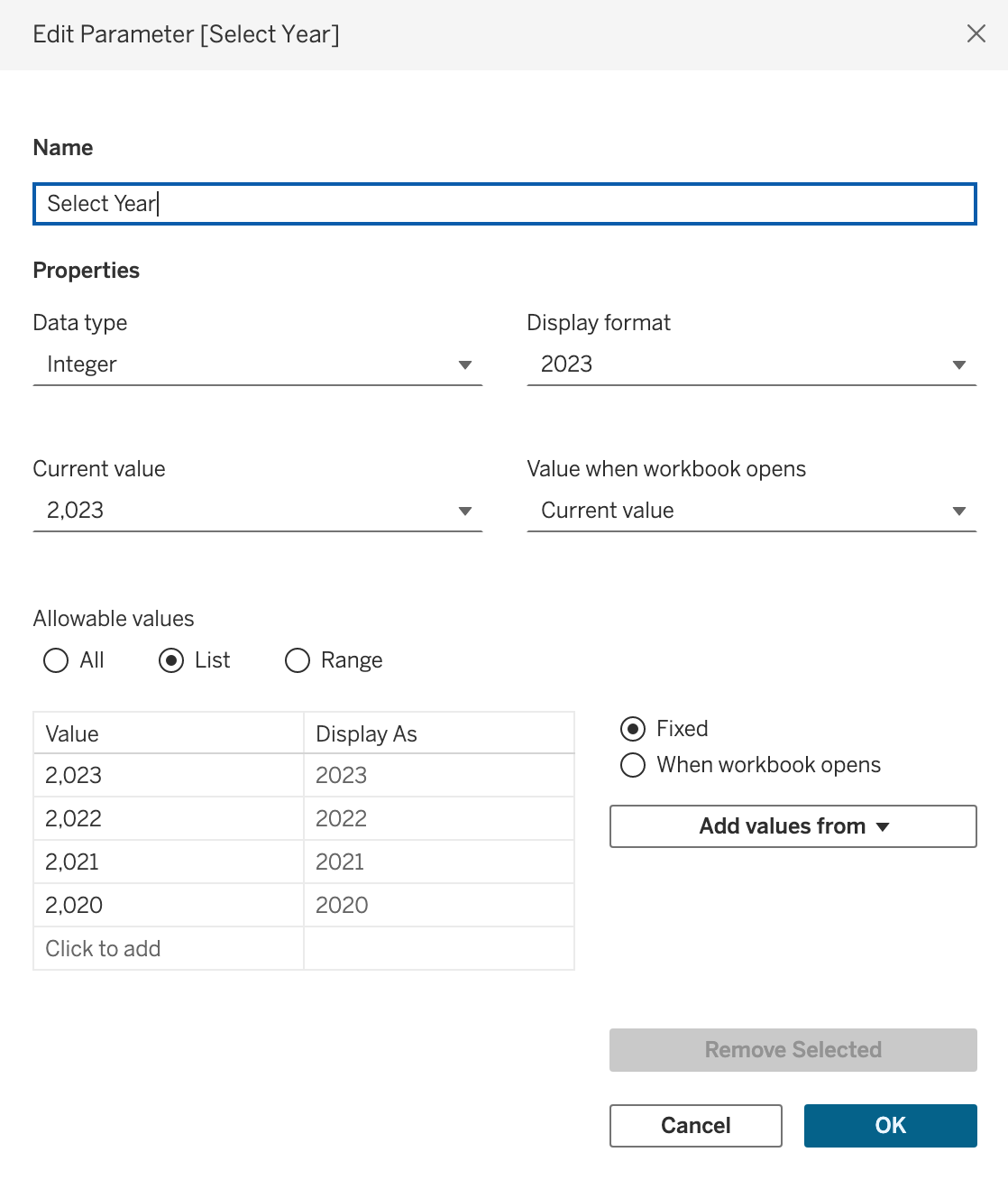
Parameters
One parameter is needed so user can choose what year they want to look at.
KPIs
Using above calculations and parameter, and other modifications and beautifying steps, such as removing gridlines and removing all excess, we end up with below KPI cards.

Bar Chart and Trend Lines
First bar chart is a bar-in-bar chart, combining two bar charts together to create the desired effect.
To add the coloured ball icons to show where current year is below previous year, I used this calculation:
IF SUM([CY Sales]) < SUM([PY Sales]) THEN "⬤"ELSE " "END
Then simply formatted their colour to be orange.
Second bar chart is a normal bar chart showing positive and negative values
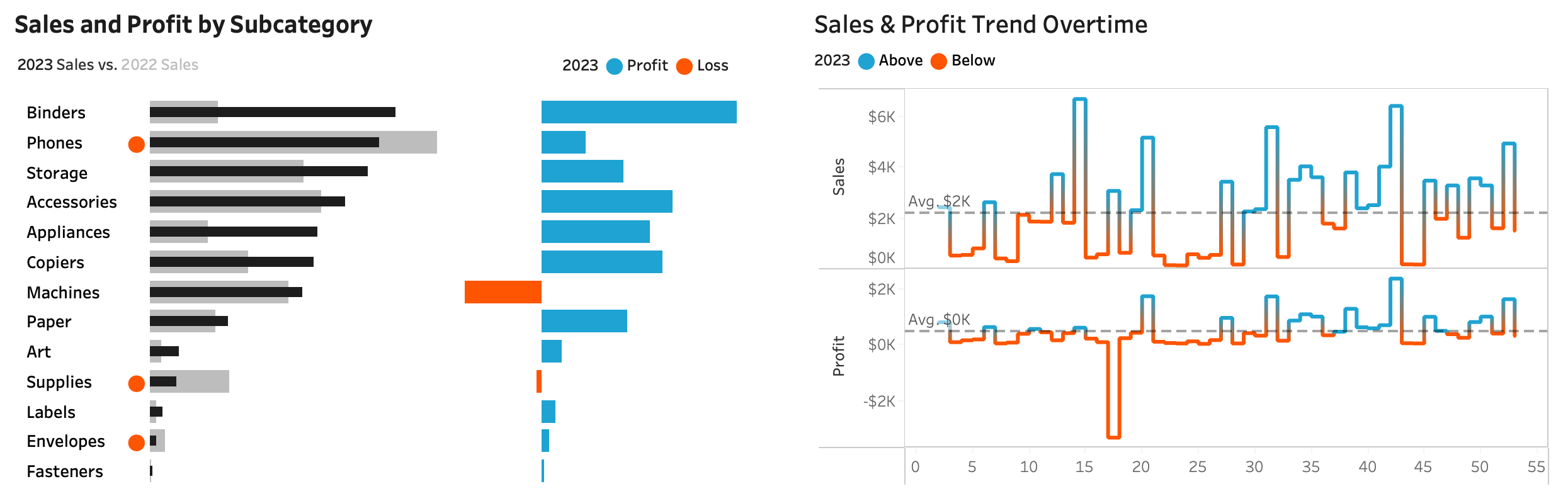
Regarding the trend lines: To colour the line according to if it is below or above the average line I used this calculation (for Profit line in this case):
IF SUM([CY Profit]) > WINDOW_AVG(SUM([CY Profit]))THEN "above"ELSE "below"END
To add the average line following settings were used:
Grouping and Top Customers
Column chart is created by using BIN option from Tableau options. Pivot table is then using previously created calculations to show the relevant values per TOP 10 customers.
Filter
Year selection is a parameter and its creation was shown at the beginning. Rest are normal filter options.
I placed them inside a container and connected that container to a button with hide/show effect. Therefore that container can be hidden based on a button press.
Building the Dashboard
Besides normal beautifying I used containers to easily place the graphs and padding to create enough space and clarity between the graphs.
Final Result